Saturday, 1 May 2010
Urgent!
Monday, 19 April 2010
Evaluation- Chess
Right at the sta
 rt of this experience we had to do some research of openings of other thrillers. This meant that we had to do close analysis to find out what certain aspects showed it was a thriller. Things such as enigma codes, restricted and unrestricted narration, traditional aspects of mise en scenes with iconography like the syringe certain techniques used by camera shots or sound all help convey and give the atmosphere that it is a thriller in the opening. As openings are suppose to draw you in and give you a sense of the film or programme you are about to watch.
Planning
When we knew what we needed to know about thriller openings it meant we could start planning our own. First off we spoke as a group about what the opening was going to be about. Jon came up with a good idea of having a man preparing what looked like a bomb, putting it in a
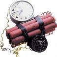 ruck sack and then walking say through a town or something. The only worry with this was it would have been difficult for us to make the prop of what looked like a realistic bomb and then obviously filming in a public place would mean it would be hard not to film people who did not want to be filmed. So then I came up with the idea of a girl running through a wood and she looked like she had been through some really horrific stuff and then have her coming back to society and civilisation. Then we pretty much went from there and came up with little ideas to add to this main idea, like things as the cars head lights shining on her and the blood going down the drain in the shower scene.
Once we had the opening pretty much planned out in our minds it was getting it all down and finalising it. I put a list of roles on the blog of what everyone had to do so that we were all sure who was doing exactly what to make sure we all did things and nothing was done twice or forgotten about. I had to do the story board which took a lot longer then I thought it was going to take, as we wanted to make it as precise as possible to assist with the real filming later on. So we planned out on paper the number of the shot and what it would show, so then I could draw it up having not missed anything out. After I had done all the drawings for it and details it was time to film it as an anamatic. I did this by sitting on a chair with the camera on the tripod filming each of the shots while doing a voice over to describe what would happen in each shot, and then used imovie to edit it in making it into an anamatic and just uploaded it onto the blog.
To show it really is just an opening we obviously did not show the rest of the film in it, b
 ut I also wrote a synopsis which is also on the blog with uploaded photos of the costume. The synopsis shows exactly what happens straight after the opening and what is later to come in the film. The costume needed to show it was a thriller as well and reflect the tensed creepy mood needed. So I got some very plain clothes that I did not mind tearing u
 p and made lots of cuts and slits in them to show she had been through some serious traumatic experience. However looking back on it now I would say I may have got a bit too carried away and made them too torn and cut, maybe making them just that little bit over the top and slightly unrealistic. One person sad it looks “just looked a bit fake” which id have to agree with. But some people may think it adds really well to the atmosphere and works well.
Filming
After the anamatic was done we were pretty much ready to go and film we had ho
 ped to do it the day we uploaded it but we did not have enough time as we had left it too late. It was hard getting a time when we were all free as we all work on different days but eventually we got a Saturday to film with nearly all the group and used the HD camera to film with. On the day the original make up girl could not meet up so I did my own make up with just normal stuff I had from home and luckily it worked really well.
We filmed during the day at a woods but we wanted it to be look like in the night so it later on in
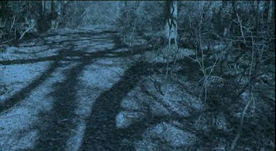 editing we used day to night footage. It was quite a cold day and the sound of the wind was quite strong in places which once again we took out a bit with editing. One of the main unfortunate problem with the filming in the woods was even though there was not any dangerous sharp objects around but the sticks and leaves would of hurt my feet a lot if I had been bare footed and what with the cold it would have been even worse. Between filming Aylish would quickly pass me my coat to keep warm so I did not get ill. And to solve the situation with the feet I had to wear black boots, but we tried in editing to make it really unnoticeable to try our best not to break continuity, just safety had to come first! We also could not film the car head light shot as none of us can drive...
We originally were not going to break the 180’ degree rule but then after a while and during filming we actually thought maybe it would be good to do so in this situation, as her life as been messed up and is not in place so the camera work should show this! Plus it does not confuse the viewer in a running seq
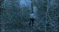 uence where as it would in a conversation. Even thou
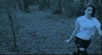 gh I was acting in the shots I did suggest ideas like lets do one like this or have the camera there, and filmed a few shots without me in. So I took much part in the filming process.
(examples of rule break)
The rest of the runn
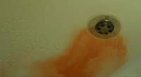 ing scene went fine and the shot of the house was no where near the woods we filmed in however it looks like it is. We could not film the shower scene the same day as we run out of time and Jon's shower did not work. So we booked another day and nearly everyone came round mine to film the last shower scene as I live closest to college. We ran out of fake blood so had to use ketchup but made it really watery and in the end it was not too bad. We wanted this colour to be really red though so needed to make the light on, so to do this we filmed in the
 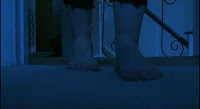 day and decided we would use day to night footage to make it look
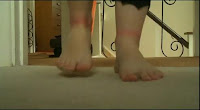 like night but then have a sound of a light switch to make it brighter (day footage) this worked fine in the end and meant the blood was red not slightly blue like it would have been if we had kept it all in night footage.
(examples of light effect, day - night)
- little bit blue
- Bare feet and then boots, tut, tut, tut...BUT its not massively noticeable so its all good
- I didn't really like the mirror shot at the end. There is quite a bit of space above Fran's head, I think that it could of been made better by making sure her head filled the empty space
- loved the make up, the music an
 d the flashbacks were really good, the titles are ok, don't really like the way you put 'AysJonFranTom,’ because you wouldn't really see titles set out like that in a proper film
- not keen on the zooms either, just think they are a little pointless but I really love the last few seconds!
- Overall, great guys
- Wow, that is amazing. The best i have seen!
- I love how your like 'what the hell?!' as you don't know what has happened, it gets you wondering what she is running from.
- The close up revealing the marks on her wrist were great on how you just casually show them
- The music is great and the flash shots worked really
fit with the title!
Overall, I was happy with the above comments as most people were really impressed with what we did and did say it was creepy and tensed. I think the points above on how it was too blue, the top looking unreal, the credits, and framing with the mirror were true. The night vision was vital we did it though as it just did not feel at all any where as near scary enough in the day. The top was cheap and its hard to chose something which does not stand out but does the job. And we positioned the credits like that as we thought it would be different and more exciting than a comma, but to be fair you don’t often see that style in films.
Questions
- Throughout the opening we used many traditional conventions like sound, fast cuts, cuts and bruises and ripped clothes for mise en scene used in other thrillers. We had the silh
 ouette of the protagonist and he had a syringe, being the weapon. We used enigma codes and restricted information to increase suspense, like why she had the mark on her? Where had she been? What happened in the flashbacks, and who it was with the syringe? Hopefully this made people wan
 t to watch more. Also in the flashback of her tied up we made it low key lighting and made it look creepy. Just before we see her we wanted to build up the sound making it increasing then she appears and its nearly silent to emphasise the fear and shock. This is also backed up with the jittery hand held camera work and the fast cuts at the start, but then as she gets to the road she is nearly back to civilisation so it gradually gets slower, with longer shots to show this long journey she has gone through.
- We chose our main character as a young girl because I suppose you could argue that girls traditionally represented as stereotypes to be more vulnerable, and more likely to be the victim. Where as if this had been showed as a guy running in the woods you may assume differently to what we wanted, like you could think he was stereotypically running away because he had hurt someone, but when you see a girl running away you naturally assume she’s running from something. The ripped clothes and flash backs also give the idea that a sexual attack may have occurred, and we thought it would suit a younger female character more then either a mature lady or a man because once again the audience should sympathise or empathise with her more, due to her traditional image of vulnerability, as a young girl. We would also hope the target audience, being teenagers over 15 years to adults, male or females, would be able to relate to her easier as they may be her age or have friends or children her age or sisters or girlfriends, so the emotional impact would hopefully help them to connect more to the character. Later on she would become stronger character and be an inspiration to the female audience.
- How did we attract the audience?
- Story told- hopefully its really interesting as you want to know what has happened to her and why. We give enough away to know she has obviously been held prisoner or been through something traumatic, however thats all we know, no details and no exp
 lanation.
 - The camera shots should make it more interesting, like the flashback shots of the syringe and the slow pan of her being tied up. The mirror and blood shots are also different, and we tried to show her cuts and bruises subtly in shots.
- The character- Shes just a normal girl, helping people to relate to her, and the state of her clothes and hair and make up should make the audience want to know more, and make them pity or sympathise with her.
- Our sound- It starts off quiet to make it build up, and theres a rush in the sound straight before we see her, then its quiet again to really build on that tension, making everyone at the edge of their seats. We put in long drones so it wasnt quiet but we thought less sound was more appropriate and was creepier, as a lot of our sound is natural from when we filmed.
What have you learnt about technologies from the process of constructing this product?
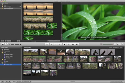
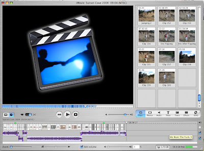
 e whole running sequence by placing shots in order and cutting them appropriately. Luckily the boys were impressed with what we did, however the first es
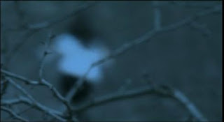 tablishing and panning shots were swapped round a few times, as i was saying how normally you would see a depth of field just before something was revealed or shown, so suggested we put it just before we saw her, but now i think it works the way it does as we thought as a group it would be more suitable to break up the panning shots. My favourite shot of the whole thing is difinateily when theres the depth of field shot of her running, which was all down to Jon, i think it fits in so well, and really reflects her long blurred out journey and mind, how nothing is clear yet. I think it just looks fanatastic and makes the running much more interesting!
We debated about whether having two foot shots in this sequence, we decided we definitely wanted the feet stepping down on to the leaves to emphasise her stepping on to the road and this being a big step a s its her return to civilisation. But there was another shot of her feet walking down the road, we thought this was too much feet in a short time, and we were running out of time too so thought best to leave it out, and I'm glad we did. We weren't originally going to have a shot of me looking up at the
  house, but I thought it would be good to just to see and check it makes sense, otherwise it may confuse the audience if she was just suddenly in a random shower, at least this looks like its her home, and in research we found establishing shots may start off in a city then a house then a window and then inside, so that you know where about that person is. And in editing we managed to connect the last walking up the road shot by match on action to the walking in front of the house really well, as Jon said we should let her walk out the shot and into the shot in front of the house. And the road was actually no where near the house, so I'm pleased how well it turned out.
I think Ays, said it just looked too unsteady and not right. So we managed to persuade them to leave that bit out and keep the straight pan going up, once again i think this was a right decision. this also happened with a zoom with the mirror shot. As the boys really liked a zoom then a mirror shot but we thought it wasn't smooth enough, and think sometimes when you use a zoom it takes the seriousness out of it and makes it look less professional. But we let them have a short zoom instead, I still am not keen on it however, it doesn't stand out as much as the other possible zooms we could of had, but i think its just cause i'm not keen on zooms in general.
We had a shot in the woods when i was like freaking out a bit but we put special effects over it to make it looked cool but slightly crazy and distorted, this would show her frame of mind, but it just didn't fit with the rest of it and was unnecessary and im glad we left it out. But we allowed the flashes of the flashbacks as it wasn't too much and wasn't over the top, and we felt it broke up and emphasised how it was a flashback and was like a big flash in her mind, obviously relating to the title, relapse.
- The story- In general the story of the final is a lot better, as in i would say it is more interesting and much more thrilling as a thriller. The use of enigma codes and restricted infromation is much more used in the final then before, but I would not say we have used them so much that it is confusing.
- The Camera Work- Before our comments were things like "too much space above heads or between characters"
 or "theres a door in the middle" so mise en scene and framing was not thought about much. I'd say in this final our framing is of a better standard. If we have left a big gap its because we wanted to for a reason, like when she walks down the road its to make her look all alone and vulnerable and as if she has just re-entered this big outside world again after being locked up for ages.
- Mise en scene- We went more over board with this as before we used no make up and only thought they should wear coats. But putting more effort in made it look better, my make up which I did actaully worked well and went better then expected as looked quite real! for the redness all i used was a lipstick and just smudged it slightly. We thought about what was in the frame alot more, like we moved tooth brushes, shower gels and things in the shower, and kept moving our bags and coats in the wood as sometimes we could see them. And in the Flashback of her being tied up we made it so there was only a duvet with no quilt on so it looked like a grim bed which she may of had to stay of for weeks. We also wanted it to be very plain against a wall so not to draw the audiences attention away from it.
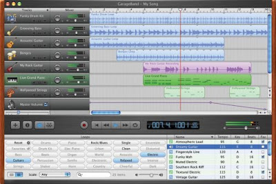
- Sound- Overall the sound is an improvement. In the preliminary we just used our natural sound from filming and didnt even use Garageband. But with this we used drones, and owl and those beats before we see her, and then the sharp sounds for the flashbacks. We did not need alot of sound for this as our natural sound was really good especially with the stepping on the leaves. But having the little bits of sound effects here and there did help with the tension.
Overall....
I have enjoyed filming this a great deal and have learnt a lot from it. If i was going to change anything i would probably take out the little zoom with the mirror as i dont think it works that well, but thats just being pickey, and there is one shot in the shower when you can faintly hear my home phone which we only realised after compleating it. But as a whole i am so pleased with the final and am proud with it, it went alot better then i thought it was going to when I thought up the idea of a girl running through the woods!
Evaluation- Ays
- We used urban settings like the woods with no housing around to create a restricted and enclosed atmosphere, but we then went onto using a more localised setting with a few houses to show sivilisation. This also represents the characters house which we can tell is hers when she is sitting in the shower.We used natural lighting for all of our opening accept when doing the sillhouette scenes. We did this because we wanted our thriller opening to be as realisic
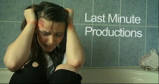 as possible so we didn't want to mess around with lighting too much, the only thing we did do was turn the footage into night vision because it was meant to be set at dusk, however if we were to actually film at dusk it left us little time to get it right in one go. The use of the sillhouette is associated with thrillers and some horror genres to create suspence and to draw the audience in as they get curious about a character or an object.
 Camera work and editing
We used cross cutting to make it look snappy and quick. This is usually used to make a sequence look quic k and fast paced making the audience get drawn in and feel tense about what is going on or what is about to happen. We used a few panning shots at the beginning to show the setting to the audience and it also gives a nice build up before any action begins. Point of view shots are used to give the audience a feel of what the character is experiencing, however we used the point of view shot as if someone was watching our main character.
Characters
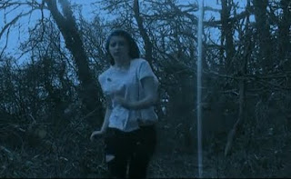
- The main and only character we have in our opening is a young teenage girl who is the protagonist. A protagonist is usually the hero of the film. The opposite to a protagonist is an antagonist which is always human in a thriller where as in a horror they are normally supernatural. For example a vampire or a warewolf. In our thriller opening we do have an antagonist, however you don't actually see him/her in the opening. The main character could aslso be seen as the victim in the opening as she is clearly running from someone who has hurt her in some way as her clothes are torn and she is bleeding and bruised.
Iconography
Dark, Creepy woods. A seringe. Ripped clothes. Make- up for bruises and home made fake blood.
Sound We used diagetic sound for things such as footsteps and the light turning on etc. Also we used it for when the flashbacks occured. This is because with the sounds that we got from filming were either not loud enough or didn't sound right. For example some of the walking scenes, the sound was not good as Chess was wearing shoes some of the time as the camera didn't catch her feet in the shot and the floor was hard and cold, so it didn't sound as if she was walking in bare feet. We also used Non diagetic sound for our background music in some parts of the opening.
How does your media product represent particular social groups?We wanted our character to be a normal 17 year old teenage girl who does everything a girl of that age does, college, friends and fun. She isn't poor and she isn't rich she is just a normal teenage girl.
Our story for our character is that she has just woken up in the woods, covered in blood and bruises with her clothes torn. She's confused and doesn't remeber what happened to her accept someone was chasing her. As we had no money to budget the opening we used old leggings and a plain shirt that we could tear up to look like she was attacked. These clothes represent her age as leggings are what a teenage girl would wear, and the plain top was simple as she would wear it and it was easy to get hold of.
As she had just found herself in the woods we didn't want to give her any props or over acessorise our character so apart from the clothes and the long hair and typical female features, they would be the only way to tell that it was indeed a female.
As we don't see our antagonist we don't know for a fact if it is a male or female or what age they are. So the only character we have in our opening is a 17 year old teenage girl.
What kind of media institution might distribute your media product and why?
We would probably look for a small indipendant film distribution company as our thiller is not going to be 'the next big thing' so a major company would be less likely to even concider our film. I think a smaller distribution company would be more likely to want to distribute our thriller because they would be more willing to try and advertise the film and sell it as opposed to a big distribution company who would not want to waste time and effort on a film that may not even sell. Once we would find a company to take our film they would then figure out the release date and how they would go about advertising it. our distributers wouyld then meet and show our film to exhibitors when they would then come to an agreement on having the film shown in cinemas and released on DVD's and such things.
Who would be the audience for your media product?
I think our film would be aimed at teenager from the age of 14 to possibly 19 year olds. I think this because it's not a grusome film but it does create a lot of questions and curiosity and I think 14 year olds are mature enough to follow and fugure things out along the way, however I think that over 19's may not be so interested and will want more of a horror or a more mature film that they could possibly relate to in some way. I also think that it is more aimed at teenage girls than it is boys just based on the fact that it is based on a teenage female character.
How did you attract/address your audience?
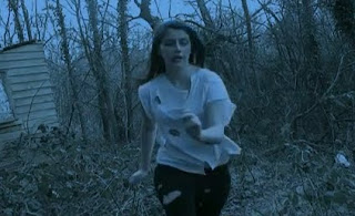
We made sure we made the opening as quick and snappy from the start to capture the audiences attention. Granted we did start with a couple of quiet slow shots to show the setting but after that we went straight into the story. This will kepp the audiences attention as they don't know what has/is going to happen. This makes then feel curious, keeping their attention as they want to find out whats going on. You see a teenage girl coverd in blood nad bruises running through the woods in bare feet and with torn up clothes looking scared and anxious, it leaves a question in the viewers mind. Also there is no dialogue just some creepy background music and sound effects to get the heart pumping.
What have you learnt about technologies from the process of constructing this product?
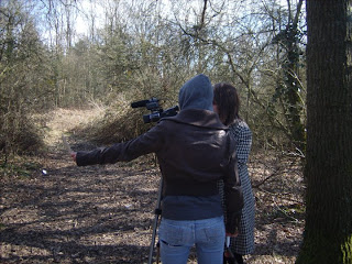
For filming the preliminary we used a HD video camera which we got from college. We had to keep setting the white balance so that whenever we moved the camera the lighting would still look the same quality. We uploaded our footage onto the editing software 'final cut pro' which i found tricky to begin with but as we went along i learnt more and got the hang of how to do things, although i still need to learn more on it as i only know the basics. For example, how to split clips and overlap them. I think that with the editing i did a good job with putting the clips together at the right moments as to cut out anything that went wrong or didn't look good with another clip and still managing to make them look as if they fitted together. After editing the product we used garageband to add in our sound effects and background music. At the beginning we did origionally agree to write the music ourselves which Jon did do. However when it came to putting it over the film it didn't fit right as he had been doing it at home so it was difficult to produce music to the film when you can't see it.
Looking back at your preliminary task, what do you feel you have learned in the progression from it to the full product? Looking back I didn't actually know that much about filming and how to film or edit well as i dodn't do much of either in the preliminary due to a lack of confidence. Where as on this task i have had more goes at editing giving me more practice and time to learn how to use the programe. Also i managed to help come up with differnt shots that we didn't use in the preliminary and i was more willing to try more technical and effective shots which made me more confident to film them and try them out to see if they worked. I have learnt how to use the camera, tripod, final cut-pro and garageband. These were things i really was not good at using by myself and had to ask for quit a bit of assistance, however since doing the thriller task I have learnt a lot more and I am now able to do things easily and swiftly with minimal help.
Researching thrillers helped me a lot as I then knew what people expected and what things in a thriller are important such as the antagonist being a human. Also watching seven.
Sunday, 18 April 2010
Jon's Evaluation
In what ways does your media project use, develop or challenge forms and conventions of real media products?
Our project was set in the woods, following on to a semi-urban setting. Initially, the mood we wanted to create for the forest scene is a fast-paced confusion. We achieved this by using hand held close up shots, with fast cutting and different angles. We deliberately included houses in some of the shots to show the urban element of the setting.
Lighting wise, we used all natural light except for the silhouette scene. We wanted to shoot at dusk, however we realised that this was not practical as we'd have to get the timing spot on, and we'd only have a short timeframe to get all the shots we needed. So we decided to use post production colour correction to adjust the footage to appear as though it was dusk.
Silhouettes are a very traditional addition to thrillers, so this worked well in adding to the confusion and explanation of the storyline.
Characters
Our only character actually seen fully in the film is the girl. She is the protaganist (which normally means the 'hero' of the storyline). She is also protrayed at the start as the victim, due to her fear, and injuries. The antagonist (villain) is implied twice, firstly where the syringe silhouette scene is shown, and secondly at the end, where there is an implied first person shot from the antagonist's point of view. The antagonist is implied to be human, as one of the key differences between thriller films and horror films are in horror films, the antagonist is normally supernatural.
- When the character is running, we left the sound we captured whilst filming in deliberately to create a confused, chopped up effect.
- An example of diagetic sound we used was the light switch.
- We added non-diagetic sounds like the background drone to create suspense.
- We began to write a score for the film, however it was difficult to write separately from the film, so once we added it, it didn't seem right.
- The syringe
- Blood
- Dark color
- Quick fast flickering to make the audience unsettled
- Wounds
- Our storyline was restricted, as we were attempting to portray from a first person view, whilst the camera wasn't first person.
- We used the camera to import the footage into Final Cut Pro, then chopped all the scenes up and began to order them.
- We learnt how to quickly do this in FCP, and then applied the colour correction filter to turn it into night footage.
- For the lighting, we used a red-head to create the shadows needed for the syringe scene
How does your media product represent particular social groups?
Initially, we wanted our character to be a normal 17 year old girl, who has been thrown into a situation that she perhaps knew nothing about before. She is of a middle social class, neither rich nor poor.
The storyline for our character is that she has woken up in a strange building, with no recollection of how she got there or what has happened to her. She is wearing very simple, torn clothes, which could have been torn during her escape, or during whatever has happened to her while being unconscious. She runs, and reaches her home. As she's in the shower, she begins to remember small segments of what has happened to her. This comes in the form of sharp flashbacks, as the stuff she is remembering is clearly distressing.
Comparing to the preliminary...
- I gained more confidence to shoot shots which were less standard
- We used a musch better camera, and had an opportunity to try out lots of different techniques
- In the preliminary, we made certain mistakes such as getting the 180 degree rule wrong.
The Opening...(chess)
http://www.youtube.com/watch?v=A63mkt8oyJA
hope you enjoy it..
Wednesday, 14 April 2010
1. In what ways does your media product use, develop or challenge forms and conventions of real media products?
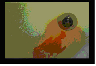
At the beginning of our research process we were asked to research thrillers to find out what sort of idea's we could include in our piece, so once my group started our research we came across some idea's we could use. from the film Phsyco we used the blood going down the drain shot because we all agreed it was a good shot for our film when she is in the shower.
http://www.youtube.com/watch?v=1L-pJyGZhRM/watch?v=1L-pJyGZhRM
this hyperlink shows that in the first one and a half minutes the film shrooms uses a girl running through some dark woods. also in the first 40 seconds of our film we use many cuts to build up the drama of her running through the forest, the drama builds up in the audiences mind because they don't know what she is running from or why she is running in the first place, many films have used this technique to build up drama and create a rush of action. in our film we also use a heartbeat when she is running which shows that she is rushed and in distress, other thrillers have used this to create suspense.
2. How does your media product represent particular social groups?
our film in particular focuses mainly on gender and age. we show gender as a weak, vulnerable girl running through the woods, running away from something. we showed her in this way because its a repres
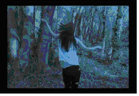 entation of a stereotypical woman, afraid, in distress and weak. this shot is of her running through the forest and as you can see her arms are flailing around, not structured and a lot more random movements this shows that she is in distress and is weak. also in this shot you can see that her cloths have been ripped which shows someone or something has ripped them, maybe whilst she was running which shows that she is desperate to run away from whatever is behind her.
we also choose age as a social group because our actors age is what we wanted our characters age to be, about 17, because young girls especially are very vulnerable to all sorts of things like attacks and rape so she was perfect to represent the character. this shot is her in the shower, havi
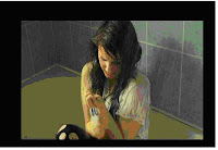 ng flashbacks of what happened to her. we used a high angle shot to show that she is in a weak situation and is in distress, which is how we represent her throughout the film.
3. What kind of media institution might distribute your media product and why?
our media product wouldn't be distributed to any major companies because they wont want to take a risk with their company by distributing our media film, so a minor company might. after that then they would work out what sort of advertising they would do, then if the film did well then try to get it produced on a wider scale.
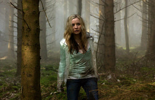
i think our audience would be young adults to adults, ages from 16 to 30, i think this because the actress in our piece is young, so people can compare themselves to her also our film is similar to the introduction of shrooms because of the girl running through the forest in the first scene, we don't know why she is or what she is running from and this film includes drugs like our film, although our drugs are discreet. this is similar to our film and has the same sort of target audience as ours, their target being young adults to adults. this picture is from a scene in the film shrooms which, if you compare it to our film is similar.
+5.jpg)
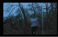
the comparisons of the film we made and the film shrooms are
- the ages of the characters look about the same
- both their cloths look ragid
- the background behind them isn't clear
- their in a forest
- in both scenes before they have both been running
young male adults would also be a target for our film because its a dark thriller which has mystery and gore in it, the blood. these are the sorts of themes that males like, for example the film phsyco was a huge success, we used the same type of blood down a d rain scene
this shot is the drain shot from the much loved film phsyco
And finally another type of person that would like this film is anyone who likes mystery because this film leaves a lot of cliffhangers and questions that, if we made a full film, would have been answered towards the end of the piece.
5.How did you attract/address your audience
people would enjoy our film because its a quick paced thriller with plenty of cliff hangers and epic moments. also people feel empathy for our character because shes just a young girl and she has been attacked and hurt, also trapped from the outside world until she escaped. from the beginning we threw the audience straight into the action, apart from some minor shots, this would instantly catch the audiences attent ion. this picture is one of the flashbacks of her trapped. the flashbacks leave the audience questions like, how did she get there? who kept her in there, what does these flashbacks mean? and these are the things which will keep our audience engrossed in our film.
6. What have you learnt about technologies from the process of constructing this product?
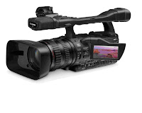
whilst filming our film we used a HD camera, which cost £4000. i had to learn how to use it, set the white balance on it and set it up and put it away, the hardest thing about the camera was getting the settings right because if you started filming and the white balance was off you would have to re shoot what you just did.
also once we finished filming we edited what we had done on a Mac, using the program final cut pro. using this was quite difficult for me because i had never even used a mac before this. once i started using this program it got a lot easier because i was more used to it, also using it we put in flash backs by editing the colour when she had her flashback, using this software i learnt that you should film a lot, even if you don't use it because at points we found that we didn't have enough footage in our preliminary so this time we had a lot of clips that we could use.
The hardest thing for me was doing the sound because every time you put sounds into the program you had to manage about eight or nine different sounds which in the end i overcame.
7. Looking back at your preliminary task, what do you feel you have learned in the progression from it to the full product?
looking back from our preliminary i have learned so much about how good quality work doesn't have to be hugely edited, because our 1 minute piece was edited a lot to look good, also we didn't keep the 180 degree rule. http://www.youtube.com/watch?v=BBPw9C57TuU this link shows what rule we should have followed. also our script and directions were very minimal, but for our final piece its improved alot, and some of our shots in our final film are better then our preliminary because they are better quality, because of the camera, and because we know what went wrong in our 1 minute piece we learnt from that and didn't make that mistake again.
when we edited our preliminary i didn't even attempt to have a go because Jon was amazing it at and i thought i would just slow down our group however I'm happy that i learned how to edit efficiently and creatively for our final film.
Thursday, 1 April 2010
Filming the shower scene- Tom
for parts of our film we needed a shower, for the girl to sit in looking upset. Originally we were going to do this shot at Jons house because it was close to where we were filming the forest scenes however because his shower broke we went to Frans house to film. At Frans house we had some trouble with the lighting because it was a sunny day and was poor continuity however we decided that we could change that through editing, making it day to night and then adding a lightswitch effect for when she walks into the shower room. Before we started filming we had to move the stuff that would have stood out in the scene, like a lynx bottle and some shampoo, so once they were out of the way we started to film.
the positives from our filming was that we got some very good shots that worked nicely with the movie, like the first shot of the girl dragging her feet which is a very low angle shot, it was a good shot and we had the sound of her dragging her feet. we also had an issue with making fake blood, we tried watery ketchup but it didn't work so in the end we decided to not use it on her face. another problem we had was what sort of shot we could have used for the blood flowing down the drain because Jon and I had different oppinions on which shot we should use, we resolved this by each of us doing a shot, showing the group and then make a decision.
We also experemented with different idea's for this scene, for example we had her freaking out and having flashbacks of what has just happened to her and also an idea of someone coming into the room with her in the shower, then having a shocked look on her face. In the end we actually used both shots in our movie.
Monday, 15 March 2010
Damages Title analysis- chess
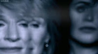
- own narrative
- few establishing shots of city with music increasing
- shot of man statue with his arms out, plain white background maybe the sky, look like name is coming out of his hand or something, lots of empty space makes our attention focus, fade of light in top left

- shots of main characters from different angles in a black room very shadowy
- flashing different shots of different statues with names in extra space
- quite white/greysih and very quick
- another quick all round shot of a main character in same black room
- shots of city life
- shot of a gold statue on a greyish one, angel, clouded sky but bit blue going like through time - more colour, hope?
- shot reverse shot of city and statues
- shot of worried hands, BCU quick
- oldish like library building..main setting maybe- shadowy
- main title- Two main characters faces which saw earlier, in like reflection then the blur and fade to back ground with a glass like window kinda effect, with lines or cracks in, and damages appears, text it almost as if its been torn.
- few credits after so title in middle, main bit
- BCU of bloody womens hands holding something. Darkish shadowy- foreshadowing?
- two more even quicker flashes of same main characters, could be whats to come
- lights in city flash up and down like when u squint at a light, distorted, crazed, panicy? city lights match increasing boom of music.

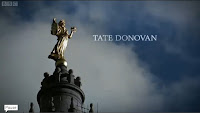
Overall
Thursday, 11 March 2010
Day to Night Footage Conversion - Methods (Jon)
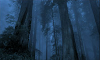
We decided that it would be too difficult in terms of timing and practicality, to film at night or dusk. We found an alternative, and that is to film in the day, and convert the footage (using colour correction methods) to night footage.
To see if this was possible, we filmed a short scene outside the entrance to college, and imported this into Final Cut Pro. After experimenting with various settings, I found a plug-in that would do this for us automatically. It also allowed us to configure exactly to our requirements, even down to the colour of the moonlight.
Filming - Chess
last weekend myself aylish and jon met up in ardingly to film. I did the make up which looked quite impressive, and we went down to the filming area and set up. Luckily it was basically deserted so we didnt annoy anyone or have any one annoying us. We filmed all the outside bits which is good as we dont need to worry bout continuity with the weather or lighting. We filmed at about 2o'clock for an hour and a half, it was really cold but i just wrapped my coat around me between filming. Even though its set in the evening/night time we were able to film in the day as we can use the night footage to change it. This means now all we need to do is the shower sequence (where i will have clothes on) and another two flashback shots. We would have done this in the weekend but the shower was broken, so we will film in my house as thats closest to college. Overall we did find it hard to film the running with out making it look really bad because it just wasnt very subtle and there was an issue with the shoes, as some area of the woods we had to wear shoes but other close up shots we wanted bare feet, however we managed to film enough so that hopefully in editing we can change it and make it look normal so you dont really notice the editing, well thats the plan anyway.
We started by filming the depth of field shot to establish the scene, this effect wasnt planned in the story board but on location we thought we might like to try it. The depth of field shots worked really well, better then we had expected. We then proceded to film the shot reverse shots while keeping the 180 degree rule, however we broke this rule once to show a different angle to her face to make it look as if she was surrounded in the chase. We struggled with the long shots and extreme long shots because when i was running through the main forest I had to wear shoes, so these then became visible but in editing we will hopefully be able to hide this. A shot which also went better then expected was a shot of my feet going down the steps onto a lane/country road. This shot was suppose to show her coming back to civilisation and looked really effective, and for these shots i had to be bare footed as otherwise it wouldnt of had the same impact. An unplanned shot was of Jons house and me coming up looking at the house. We werent going to bother with it, but I suggested we should to make the link from the walking down the road to the house which we actually in totally different locations but look as if its down the same road, being match on action. This actually did look really good, and will hopefully explain the jump from the lane to the shower scene. We only got chance to film one flashback as the shower was broken, so we need to film another few shots of flashbacks and in the shower which we plan to do on Wednesday, so unfortunately we missed the last deadline.
Wednesday, 10 March 2010
Tom- Zombieland
- the credits are red and fall over when people run past them, this matches the credits with the action, also its very unique because not many other films do this
- they fall over and crumble which represents the atmosphere around them, the world begginging to end because of zombies taking over
- the atmosphere around the credits shows that this film is a action comedy because we find it funny, zombies killing people because we know it will never happen and its violent.
this shot is the first time you see the title, this man is smashing through it, also the zombies behind him look like they are trying to get him, this shows that this film is violent and gory, because of the blood around the zombies mouth. the lettering for the word is slighty at an angle and in this sequence it is broken, this shows the intence action that carrys on through the film.
Tom- True Blood
- opening credits are plain white, but the font is different sizes and different widths which could suggest that the series is quite unorganised, in the episode
- behind the credits there is constant action going on, very dark disgusting things and erotic gestures which could show that the surroundings are disgusting and common
- this shot is of a dead rat, the credits under it are not all the same width and font, also the dead rat is disgusting, this could show straight away what type of film this is
- the main title is also shocking because it looks like blood has been put behind the title, the title is white which makes the colours more bold. also the blood has lines of black going through it which makes the title look disgusting.
Monday, 8 March 2010
'Five days'- Chess
- before any action, credits being the first thing
- music sad beat
- blue shade/tine dark outside
- silhouettes
- darkly dissolves or fades to another shot with multiple names, just names
- white wrighting
- blurry focus like a ghost or dream
- blurred together by lights or candles
- police sign imposed over the top
- speckly
- music increases with man in pool to a sharp stabby screeching sound
- text flivkers in an out and at one point a line of it flows across screen like the police do not cross signs
- fades to a lighter shot of trach and bloody shoe with 'five days' to the side
- then five days dissappears and the the 's' in 'days' turns into a '1' becoming 'day 1' then the background dissolves by light to a shot of the clouds in the sky with day 1 remaining in shot
- then thats when the film starts with the first shot of the credit scene
Overall
This sequence works well creating a slightly suspicious, dreamy awkward and tensed mood. We see possible characters and it forshadows what may come with the train and the baby and the shoe. But as the shots are surrounded in darkness it gives the idea it may be a dark story with twists and secrets to be revealed. The transformation to title to day 1 joins the title and directly links it to the film, giving the sequence even more relevance. The music adds to the whole slightly creepy atmosphere and gives and emotional tie with the start of the film.
'Enemy of the State'- Chess
- text is odd, symbolic, like egyptian style so gives old historic and detailed impression
- after main opening, has own narrative

- 'Enemy of the state' big and bold over an establishing shot of city -washington D.C
- weird, quick, fast, jolty shots like a birds eye on city like on a cop programme with chases from below helicopter
- beeps and pc sounds throughout, quick, out of sync
- shots spinning out of control, crazy, chasey,
- police cars, sirens, bright lights, gun pin point target thing, security cameras
- phone like sounds
- police dogs barking
- white dotted around
- point of view from cars like inside the chase-like actual footage.

- music changes from beats and quick with a sad slow soft emotion mooving background music, changes mood in a way to sad victory or a loss?
- then to get back to film out of own narrative it does the no signal black and white flashy tele static thing and then back to film, with normal detective typing text
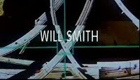
Overall
I was really happy when i found this just because the credits are very different and really stand out, id recommend my teachers using it in future! It has its own narrative and really gives the feel of a cop chase and a scatty adrenaluine pumping action packed film, but also the song gives it emotion. And the text being symbolic could be linked in with the film. The cameras and birds eye views give the sense of being on the run or trying to hard but it being hard to, this is what draws you in and keeps you at the edge of your scene. The sounds and static last shot show its hight tech which contrast with the text. But in conclusion this narrative gives the text and title a bit of excitement and set that excitement for the rest of the film by drawing you in.