Monday 15 March 2010

Damages Title analysis- chess


Notes


  • own narrative


  • few establishing shots of city with music increasing


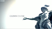
  • shot of man statue with his arms out, plain white background maybe the sky, look like name is coming out of his hand or something, lots of empty space makes our attention focus, fade of light in top left


  • shots of main characters from different angles in a black room very shadowy


  • flashing different shots of different statues with names in extra space


  • quite white/greysih and very quick


  • another quick all round shot of a main character in same black room


  • shots of city life


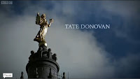
  • shot of a gold statue on a greyish one, angel, clouded sky but bit blue going like through time - more colour, hope?


  • shot reverse shot of city and statues


  • shot of worried hands, BCU quick


  • oldish like library building..main setting maybe- shadowy


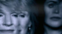
  • main title- Two main characters faces which saw earlier, in like reflection then the blur and fade to back ground with a glass like window kinda effect, with lines or cracks in, and damages appears, text it almost as if its been torn.


  • few credits after so title in middle, main bit


  • BCU of bloody womens hands holding something. Darkish shadowy- foreshadowing?


  • two more even quicker flashes of same main characters, could be whats to come


  • lights in city flash up and down like when u squint at a light, distorted, crazed, panicy? city lights match increasing boom of music.


Overall

Thursday 11 March 2010

Day to Night Footage Conversion - Methods (Jon)


We decided that it would be too difficult in terms of timing and practicality, to film at night or dusk. We found an alternative, and that is to film in the day, and convert the footage (using colour correction methods) to night footage.

To see if this was possible, we filmed a short scene outside the entrance to college, and imported this into Final Cut Pro. After experimenting with various settings, I found a plug-in that would do this for us automatically. It also allowed us to configure exactly to our requirements, even down to the colour of the moonlight.

Filming - Chess

Well,
last weekend myself aylish and jon met up in ardingly to film. I did the make up which looked quite impressive, and we went down to the filming area and set up. Luckily it was basically deserted so we didnt annoy anyone or have any one annoying us. We filmed all the outside bits which is good as we dont need to worry bout continuity with the weather or lighting. We filmed at about 2o'clock for an hour and a half, it was really cold but i just wrapped my coat around me between filming. Even though its set in the evening/night time we were able to film in the day as we can use the night footage to change it. This means now all we need to do is the shower sequence (where i will have clothes on) and another two flashback shots. We would have done this in the weekend but the shower was broken, so we will film in my house as thats closest to college. Overall we did find it hard to film the running with out making it look really bad because it just wasnt very subtle and there was an issue with the shoes, as some area of the woods we had to wear shoes but other close up shots we wanted bare feet, however we managed to film enough so that hopefully in editing we can change it and make it look normal so you dont really notice the editing, well thats the plan anyway.

We started by filming the depth of field shot to establish the scene, this effect wasnt planned in the story board but on location we thought we might like to try it. The depth of field shots worked really well, better then we had expected. We then proceded to film the shot reverse shots while keeping the 180 degree rule, however we broke this rule once to show a different angle to her face to make it look as if she was surrounded in the chase. We struggled with the long shots and extreme long shots because when i was running through the main forest I had to wear shoes, so these then became visible but in editing we will hopefully be able to hide this. A shot which also went better then expected was a shot of my feet going down the steps onto a lane/country road. This shot was suppose to show her coming back to civilisation and looked really effective, and for these shots i had to be bare footed as otherwise it wouldnt of had the same impact. An unplanned shot was of Jons house and me coming up looking at the house. We werent going to bother with it, but I suggested we should to make the link from the walking down the road to the house which we actually in totally different locations but look as if its down the same road, being match on action. This actually did look really good, and will hopefully explain the jump from the lane to the shower scene. We only got chance to film one flashback as the shower was broken, so we need to film another few shots of flashbacks and in the shower which we plan to do on Wednesday, so unfortunately we missed the last deadline.

Wednesday 10 March 2010

Tom- Zombieland

Zombieland Credits


  • the credits are red and fall over when people run past them, this matches the credits with the action, also its very unique because not many other films do this


  • they fall over and crumble which represents the atmosphere around them, the world begginging to end because of zombies taking over


  • the atmosphere around the credits shows that this film is a action comedy because we find it funny, zombies killing people because we know it will never happen and its violent.


this shot is the first time you see the title, this man is smashing through it, also the zombies behind him look like they are trying to get him, this shows that this film is violent and gory, because of the blood around the zombies mouth. the lettering for the word is slighty at an angle and in this sequence it is broken, this shows the intence action that carrys on through the film.

Tom- True Blood

true blood opening credits
  • opening credits are plain white, but the font is different sizes and different widths which could suggest that the series is quite unorganised, in the episode

  • behind the credits there is constant action going on, very dark disgusting things and erotic gestures which could show that the surroundings are disgusting and common

  • this shot is of a dead rat, the credits under it are not all the same width and font, also the dead rat is disgusting, this could show straight away what type of film this is

  • the main title is also shocking because it looks like blood has been put behind the title, the title is white which makes the colours more bold. also the blood has lines of black going through it which makes the title look disgusting.

Monday 8 March 2010

'Five days'- Chess

Notes
  • before any action, credits being the first thing
  • music sad beat
  • blue shade/tine dark outside
  • silhouettes
  • darkly dissolves or fades to another shot with multiple names, just names
  • white wrighting
  • blurry focus like a ghost or dream
  • blurred together by lights or candles
  • police sign imposed over the top
  • speckly
  • music increases with man in pool to a sharp stabby screeching sound
  • text flivkers in an out and at one point a line of it flows across screen like the police do not cross signs
  • fades to a lighter shot of trach and bloody shoe with 'five days' to the side
  • then five days dissappears and the the 's' in 'days' turns into a '1' becoming 'day 1' then the background dissolves by light to a shot of the clouds in the sky with day 1 remaining in shot
  • then thats when the film starts with the first shot of the credit scene

Overall

This sequence works well creating a slightly suspicious, dreamy awkward and tensed mood. We see possible characters and it forshadows what may come with the train and the baby and the shoe. But as the shots are surrounded in darkness it gives the idea it may be a dark story with twists and secrets to be revealed. The transformation to title to day 1 joins the title and directly links it to the film, giving the sequence even more relevance. The music adds to the whole slightly creepy atmosphere and gives and emotional tie with the start of the film.

'Enemy of the State'- Chess

Notes
  • text is odd, symbolic, like egyptian style so gives old historic and detailed impression
  • after main opening, has own narrative

  • 'Enemy of the state' big and bold over an establishing shot of city -washington D.C
  • weird, quick, fast, jolty shots like a birds eye on city like on a cop programme with chases from below helicopter


  • beeps and pc sounds throughout, quick, out of sync


  • shots spinning out of control, crazy, chasey,
  • police cars, sirens, bright lights, gun pin point target thing, security cameras
  • phone like sounds
  • police dogs barking
  • white dotted around
  • point of view from cars like inside the chase-like actual footage.
  • music changes from beats and quick with a sad slow soft emotion mooving background music, changes mood in a way to sad victory or a loss?


  • then to get back to film out of own narrative it does the no signal black and white flashy tele static thing and then back to film, with normal detective typing text

Overall

I was really happy when i found this just because the credits are very different and really stand out, id recommend my teachers using it in future! It has its own narrative and really gives the feel of a cop chase and a scatty adrenaluine pumping action packed film, but also the song gives it emotion. And the text being symbolic could be linked in with the film. The cameras and birds eye views give the sense of being on the run or trying to hard but it being hard to, this is what draws you in and keeps you at the edge of your scene. The sounds and static last shot show its hight tech which contrast with the text. But in conclusion this narrative gives the text and title a bit of excitement and set that excitement for the rest of the film by drawing you in.

Derailed - Chess

Notes

  • right at the start on first shot
  • text like blinds or doors, letters like open and close to show and dissappear on screen. firstly dotted round a prison and then doors open too, flicking in and out
  • dotted around white and plain
  • 'Derailed' half way through sequence of credits on rail, revealed/ emphasised by depth of field shot and is shown for longer
  • Title is shown ontop of a wire fence
  • then credits continue

Overall

This sequence is quite simplistic but it works and still relates to the film. Though they do not have their own narrtive the credits are plain and simple, when in a prison things are like that like the living conditions. And its irony how the credits are simple yet the storyline had big twists and is very in depth and complex. The impact of showing 'Derailed' on the wire railing fence is that it suggests maybe someone will be released and get out of the rails, or something is coming out into the open. They go along for a while because its quite slow, this could show the later task in hand may be slow moving but critical.

Old Boy- Chess

Notes
  • start- small red over moving image and moving them selves, like ticking round in a circle
  • progress to a fade by light from wings to clock and a weird sound joining the credits to the film
  • clock is like dissolving behind credits and are disfigured- bending, and time is normal then goes backwards, smudging, distorts, out of focus, ghostly like with credits dotted around outside
  • weird, qwerky back ground music, sounds or a co co clock
  • then the outer ring from clock make the 'O' and three hands on a clock make the 'Y' and the Y is in the O but they seperate leaving gaps for the other letters in 'old boy' to show title, and then continue ticking around (graphic match)

Overall

these credits have their own movie and are seriously linked to time or clock with emphasis not only on the background moving image but on the movement of each letter and the graphic match to make the main title. Its really clever and is really effective in showing the link. Is almost like a race against time and the weird distorted image and bright lights, reflect how later on something abit out of the ordinary may happen, something unusual and brightly shocking.

The Orphanage - Chess

Notes

  • a hand- young child, possibly a girls hand/arm, pale bit ghostly like
  • wallpaper- old, flowery, quite dark grey or blackish colour on top, underneath theres a redish colour so dark and dull at first glimpse then light underneath with more life = hope? maybe shows may be poor as so old style
  • Tearing- frantic, intrigued hands, revealing secrets? naughty, childish, finding out things
  • Music- classic, ballroom, strong, powerful, oldish style, exaggerated tearing sounds
  • lots of child hands tearing away at the title or at the ''orphanage'' revealing black secrets
  • shadows- creepy, sinister, dark and dingy, suggests evilness and bad things
  • cracks- secret being cracks? showing tears in way of life? (lots of enigma codes) emphasising what we wouldnt normally see, to show how deep it may get or how deep the secrets are

Overall

Things such as tearing, cracks, shadows and hands all show us not only partly what we already know but where the film may end up, and maybe foreshadowing the ending. The hands look like childrens hands and we have already seen many children as the credits come just after a few minutes, we also know it is set in an orphanage where the children are. But things like the cracks and shadows suggest something more sinister and dark lurking. What with the tearing and also cracks could mean secrets and the facts a childs hands are reaviling it could show that it will be seen or discovered through a childs perspective causing emotional impact plus children dont normally know things as they are seen as innocent so maybe the fact that all the children at the end are pulling away at the words and title could show how they find out whats been hidden for years, but also likely a shocking or sinister dark secret.

Friday 5 March 2010

Ays- titles and credits

The Orphanage

Titles- The film starts and then shows the titles and credits then goes back to the film.

The hands that tear back the wallpaper are small child like hands which makes us think that it is children pulling it back.

For the first part of the credits it's only one hand pulling back the wallpaper but at one point there are about 5 or 6 showing that they are working together.

Mise En Scene- The wallpaper is very old which shows it's probably set in the earlier days because no days orphanages/care homes would be bright and colourful with things such as cartoons on the walls for the children.

It seems quite institutional as it's dark and gloomy.

Also the childrens clothes are very bland, dark and plain which also shows how old fashioned it is as now days children would wear whatever clothes they want rather than having a uniform, and this also relates back to the title and credits because you can see the childrens arms.

Because they have already seen the children and the uniforms you can tell that they are the orphans as you can see the uniform on the childrens arms.

Music/SFX- The music is very emphasized in places such as when the credits are revealed to show them up more and draw your attention to them. Also the music has a very sinister feel to it.

Lighting- They have shadows of the childrens hands on the wallpaper when they are about to rip off the wallpaper they could be reaching out for eachother as in one part they look like they are trying to hold on to one another. This shows that people could be working together or trying to save someone.

Old Boy

Titles- There is a mixture of titles and credits that are on the image and off the image. The credits are on the images and then carry on off the image going into the titles.

Music- The music is upbeat but has a slight creepy tone to it giving it a slight chill.

There is sound effects of a cuckoo clock which also gives off a scary feeling.

There is a clock ticking noise that happens but it's all disorientated giving it a uneasy feel.

Credits- the credits when its on the moving image some of them turn like the hands on a clock then when the credits change to the next ones the letters change as if they are the letters on a board at the airport or train station.

The hands on the clock start going forwards then start going backwards giving it a freaky and scary feeling.

Five days

Titles- It starts off with different images with the credits going over them to then end up with the title over an image.

Credits- The credits come in blurred and then go into focus whislt slowly floating across the screen to then fade out and then repeat to the next set of credits.

Then for the title it comes up blurred with the image and then focuses to then have the word 'Five' and the 's' on the end of 'days' blur out and the 's' is then blurred into the number 1.

Lighting- The lighting is quite dark throughout giving the credits a nice background to go onto as they are a light colour so it stands out.

Around the images it is blurred leaving you to focus on the middle part of the clip and the credits.

When the image fades out and goes blurry it then still shows blurred lights of the next part of the clip so something is always going on and it doesn't just go to black and then go into the next part.

This makes it flow nicely and keeps your attention.

Music- The music is dark and chilling with a nice hard beat which could possibly seem as if a heart is beating.

Also in the middle there is a part that sounds as if it is from the thriller 'Phsyco' but has been adapted a bit giving it a more chilling feeling.

True Blood

Credits- The opening credits are over a moving image and the title ends on a moving image.

The credits are quite small and in a light colour which they place over dark parts of the image.

However sometimes it is on a lighter part of the image making it harder to read.

The font sizes are all differnt making it seem dis-organised and quirky.

The title ends up on a red background making it stand out and grab your attention.

Music- The music is upbeat but if you listen to the lyrics and know the series then you will understand that it has a meaning and relates to the episode.

Lighting- The lighting changes throughout the opening because some parts are dark and give off a grusome feeling but others are light.

This may show two differnt sides as in a good and bad side because of the colours and lighting change between each part.

However the writting of the credits stay the same throughout.

Casino Royal

Credits-The credits come up with a moving image almost straight away.

The credits are white and are placed on bold, blank parts of the image so they show up clearly and stand out.

They quickly fade on then fade off again after a few seconds then move on.

Some of the credits look as if they are being typed on a computer as if for a file or something of that sort.

The title is the number 7 card which then gets shot twice leaving 0 shapes before the 7 which ends up as 007 which is when it then goes into the typing.

Music- The music starts off slightly slow but then builds up into a quick and upbeat tune giving it a sence of urgency then it goes back to being all serene and mysterious.

Other- In places it shows the view of someone firing a gun so you can see the guns point of target which then turns into a roulette wheel.

At the beginning it also has he same symbols in patterns which then start changing and rotating making it look like a calidescope.

Also it shows guns being fired and instead of a bullet it shows yet again the card symbols such as a heart or the spade.

This gives the impression that the film includes alot of gambling perhaps in the way of money or with peoples lives.
Monday 1 March 2010